VisIt is "a free
interactive parallel visualization and graphical analysis
tool for viewing scientific data on Unix and PC
platforms." We will be using VisIt to help plot
fields from our class program assignments.
The VisIt user community wiki page is visitusers.org, and contains a short web tutorial.
Official documentation is available off the home site pages here.
Test data set: PeriodicBC
Below I describe visualizing the PeriodicBC.nc data
set (.nc is a suffix for NetCDF
data files). Click on any image to see it full
sized.
Information
The VisIt home page is here; a Wikipedia page on it may be found here.The VisIt user community wiki page is visitusers.org, and contains a short web tutorial.
Official documentation is available off the home site pages here.
Downloads
The downloads page contains many choices include source code and also executables for Linux, Mac and Windows systems.Getting test data
You may find a few test data sets at: http://rfd.atmos.uiuc.edu/Visit-data/Test data set: PeriodicBC
Below I describe visualizing the PeriodicBC.nc data
set (.nc is a suffix for NetCDF
data files). Click on any image to see it full
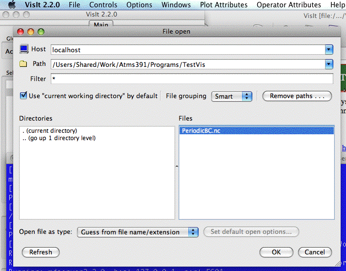
sized.| First download the desired data set to your
system. On Windows systems in our
classroom, you will need to first create a
scratch sub-directory for yourself (likely under
D:) and put the data file there.
After starting VisIt (on the mac, from Terminal), open the data file. |
 |
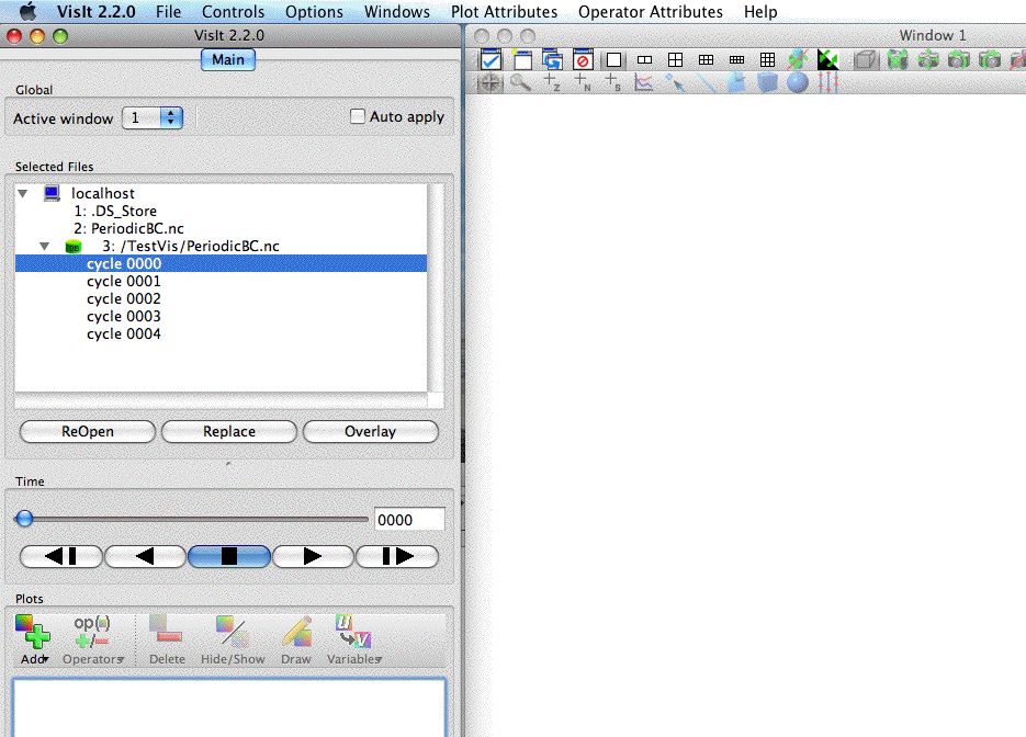
| The windows should look something like shown
at right. The PeriodicBC.nc file will be open,
showing 5 data times (labeled cycle 0000
... cycle
0004 in the control window on the left
side of your screen). You next click on the
"Add" button under Plots (again in the left
control window). |
 |
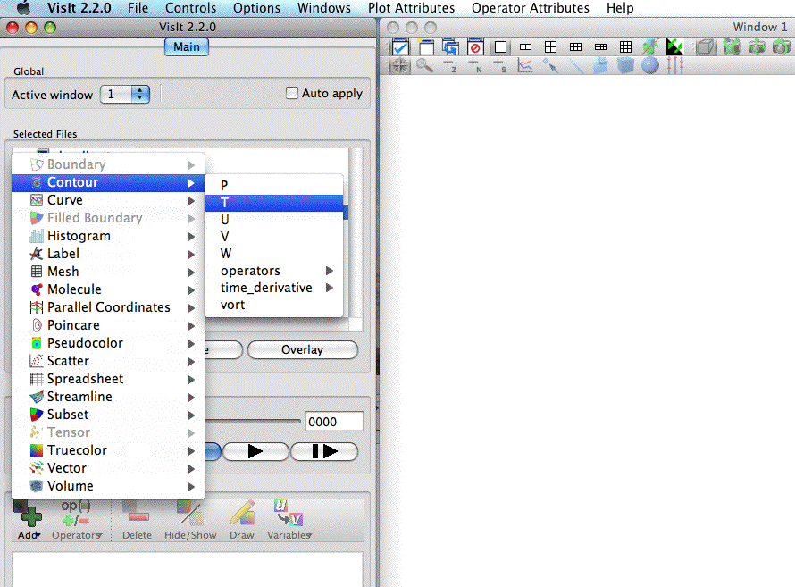
| Here I have selected the Contour plot type,
and the field T (the only field of interest in
this particular data set). In response, VisIt puts
a line "Contour - T" in the Plots control window
on the left. Nothing else happens yet, as you
have the option to load up other graphics and/or
to alter the plotting parameters for the plots,
or to begin plotting. In this case, simply
click on the Draw button under the Plots control
window on the left side of your screen. |
 |
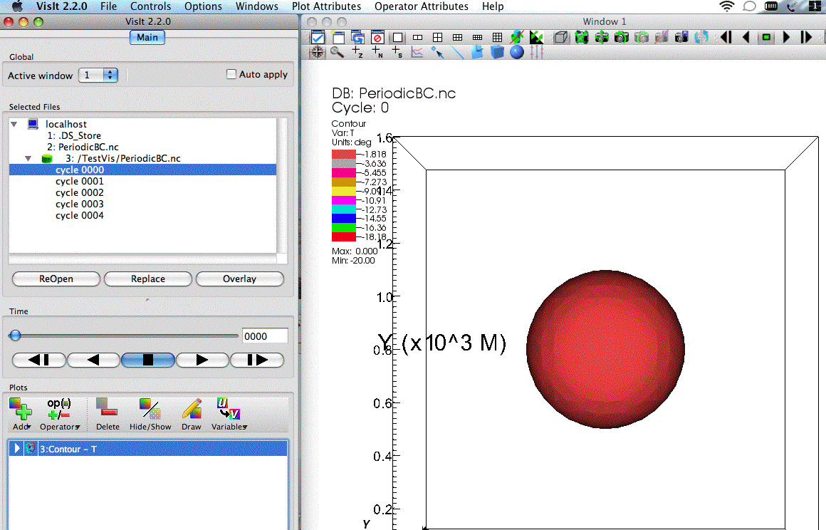
| The result of clicking Draw. The
default plot view shows you a sphere, looking
down on the 3-D domain from above (so Z-axis is
into the screen, X is to the right, and Y is
towards the top). The data field being plotted
ranges from 0 to -20, but all the "colder"
values are within the sphere, so you see only
the one surface (a cutaway would show more
detail inside). Click on the DVD-like controls on the left window to step through the 5 data times. In so doing you will see the sphere disappear out the top (+Y) boundary and reappear in the bottom (-Y) boundary. |
 |
| The viewpoint has been altered by clicking the mouse inside the plot window (on the right side of your screen) and moving the mouse while it is held down. This 'drags' the object you are viewing as if you were palming a ball. I have rotated the surface down and left so the view is from +X, -Y and above. The time has been stepped forward to cycle 0002 (3rd data time), when the sphere appears sliced open as it enters the -Y boundary. | 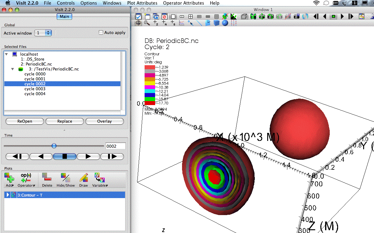 |
| Same viewpoint but when altering the surface (in Visit, "Contour") plot parameters. I have double-clicked on Contour - T in the Plots window and altered the parameters: Selected by was changed from N levels to Value(s), the value (constant surface) was chosen to be -2, the color table was set fixed by clicking Single, and I then clicked Apply and Dismiss to see my plot. The surface designating all points where the T field is -2.0 is shown; lower (colder) values are hidden within this sphere. | 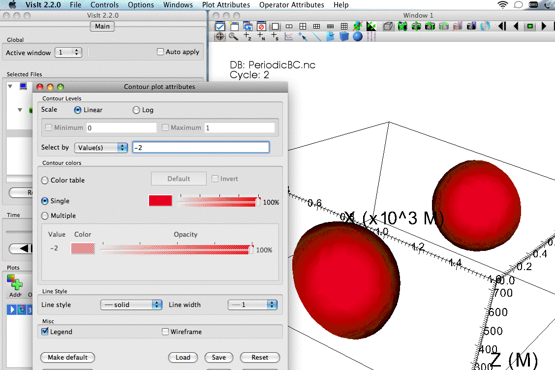 |
Test data set: Atms502fall09.nc
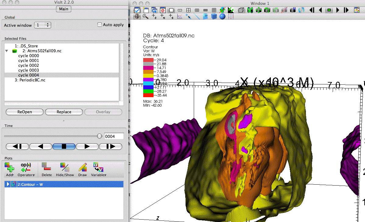
| I have opened the data file Atms502fall09.nc
. First I have made a simple 3-D
surface plot. Under the Plots control
window on left side of screen, I clicked on the Add button,
chose Contour,
and selected the W
field (vertical velocity in meters/s). I
then clicked on Draw,
taking the default plot settings. The viewpoint is from -Y, looking towards +Y; X is to the right, and +Z is towards the top. When done with this plot, click on Delete. |
 |
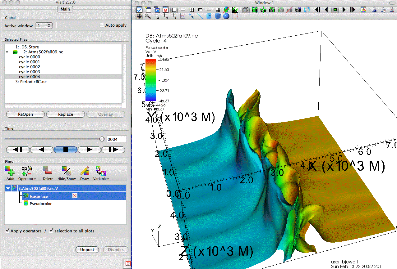
| In this example, one field is being painted
('mapped onto') another. The 3-D surface is of the
T field; the colors on it represent the V field,
looking towards +Y and down. To produce this plot,
click on Add; choose Pseudocolor, then V. Now
click on "+/- Operators" and select Slicing, and
then Isosurface. Then click on the white triangle
to the left of the line "Pseudocolor -
Isosurface(V)" to open up the plot settings below
it, and double-click on Isosurface. Change Select by to
Value(s), enter a value in the text box next to it
as -3, and then click on Variable, select Scalars, and
choose T. Click Apply, and Dismiss, and then
Plot. The shape represents the temperature
(T) field, with blues showing where negative V
values lie, and tan colors representing V>0 on
this same T surface. |
 |
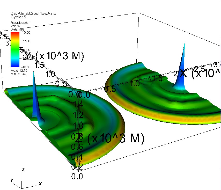
Test data set: Atms502outflowA.nc
| This data set shows colliding outflows in a
quiet (calm) environment. I have set a pseudocolor
choice of W
(with Scale limits in pseudocolor of -15 to +15),
mapped onto an Isosurface of T at
-1.5˚. View is towards +X, +Y and down. |
 |
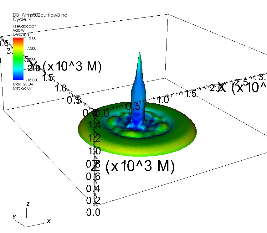
Test data set: Atms502outflowB.nc
| This data set shows two combined outflows
reaching the surface in the center of the
domain. Plot choices are identical to Atms502outflowA.nc
above. |
 |
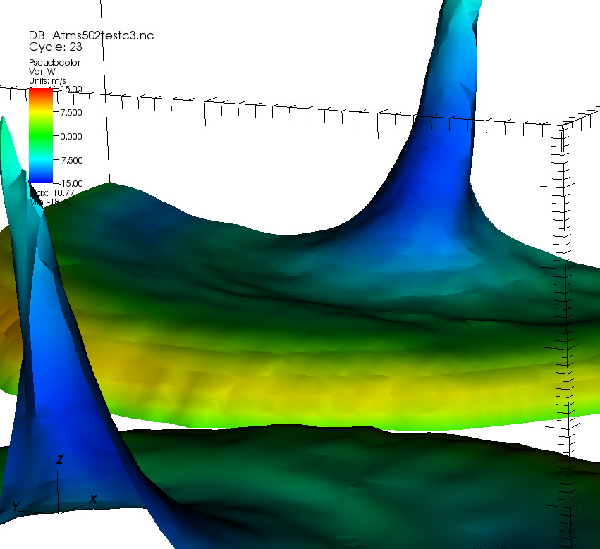
Test data set: Atms502testc3.nc
| Two colliding outflows with different
characteristic V (y-direction) velocities.
Plot choices are identical to the Atms502outflow
cases above. |
 |